Aeris Communications is an IoT connectivity and Solutions provider. Hired as Creative Design Manager, I was the first in-house designer in the company's history. From 2017 to 2021 I worked to establish a unique visual style for the brand, and designed - or oversaw the design of - most of the creative materials Aeris put out into the world (hey, sometimes people go rogue).
Designing Visual Distinction
At the time I arrived at Aeris the brand consisted of a logo, a color palette and...that's it. Their website, marketing materials and advertisements were made with basic design templates by whoever could at any given time and lacked a unified style.
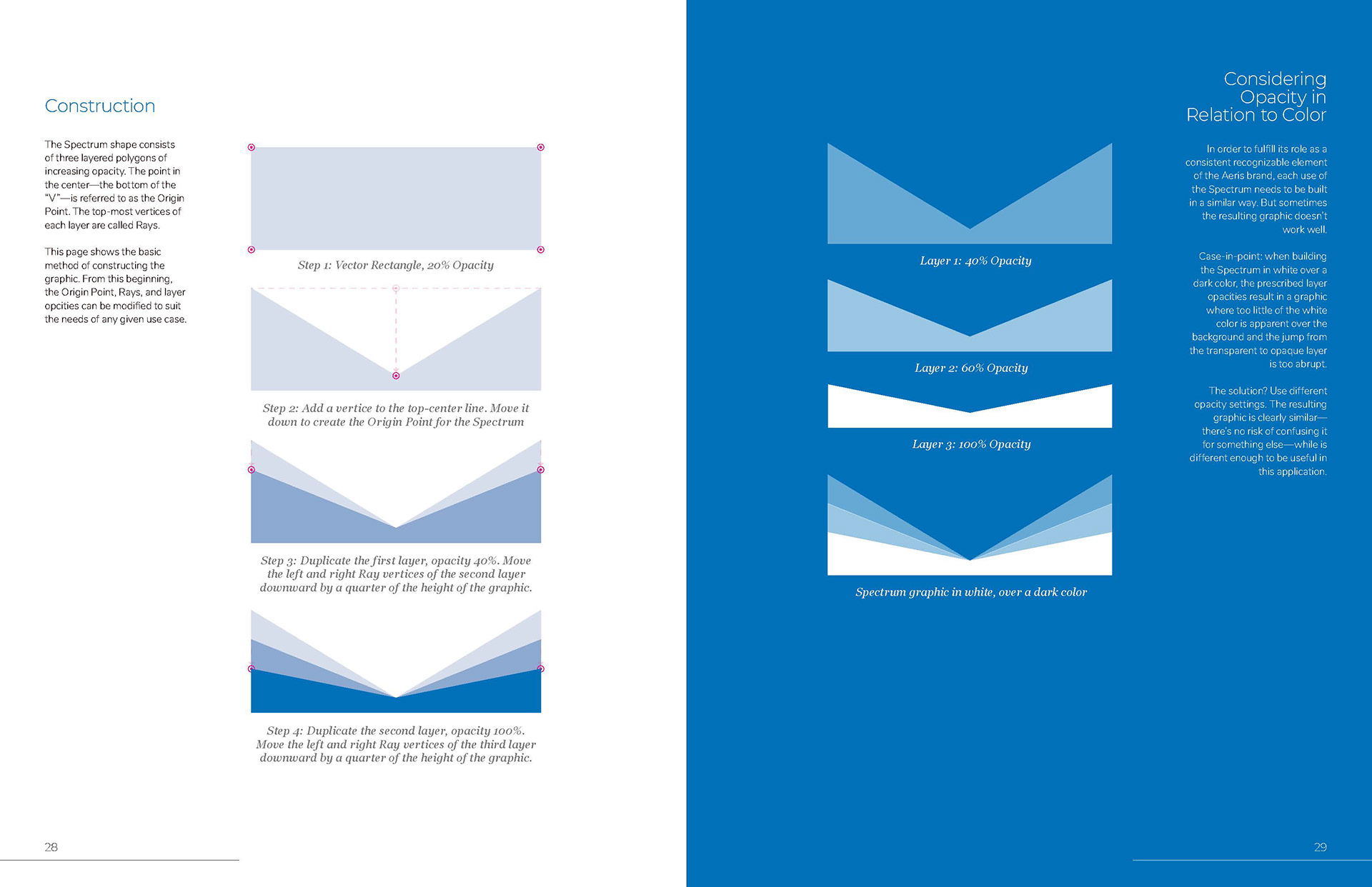
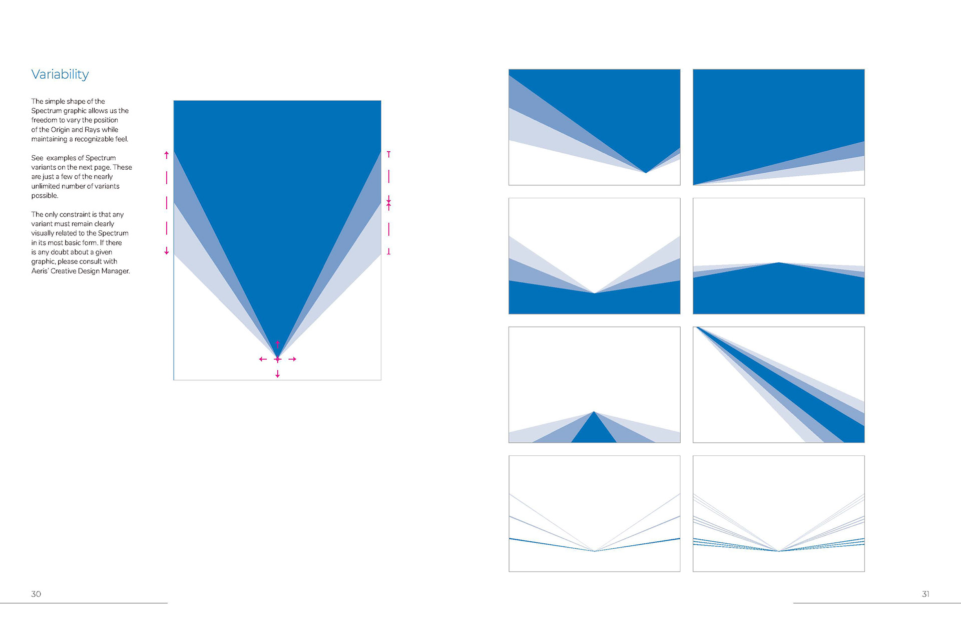
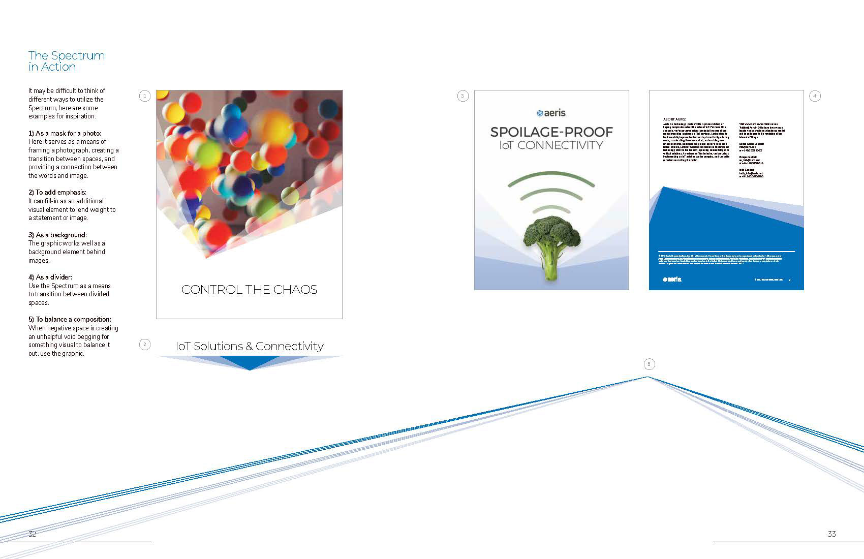
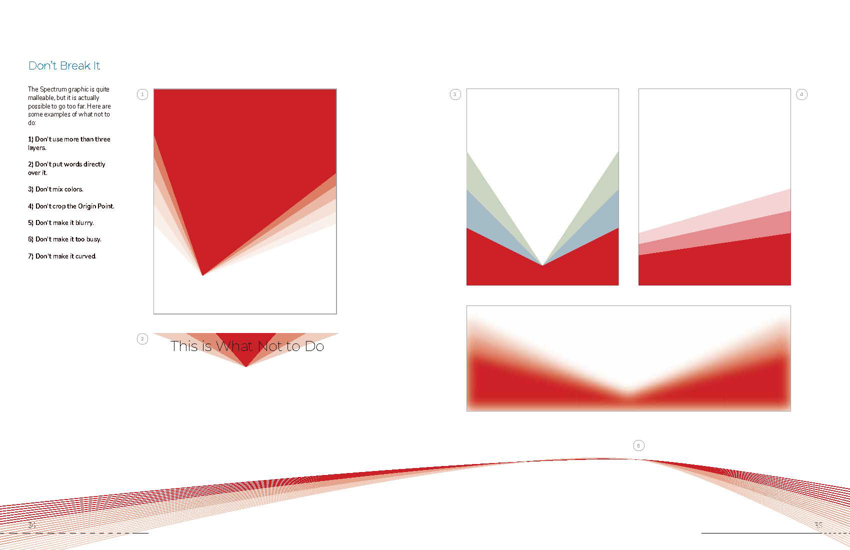
One of my first assignments was to build an expanded visual style based on those elements. This was a great case for a dynamic graphic, a consistently recognizable visual component of the brand which is versatile enough to be applied in many different ways.
I called it the Spectrum Graphic.
This simple graphic could be used as a frame, divider, or a visual element all on its own. Check out these excerpts from the brand style guide:


Adding Versatility Through Typefaces
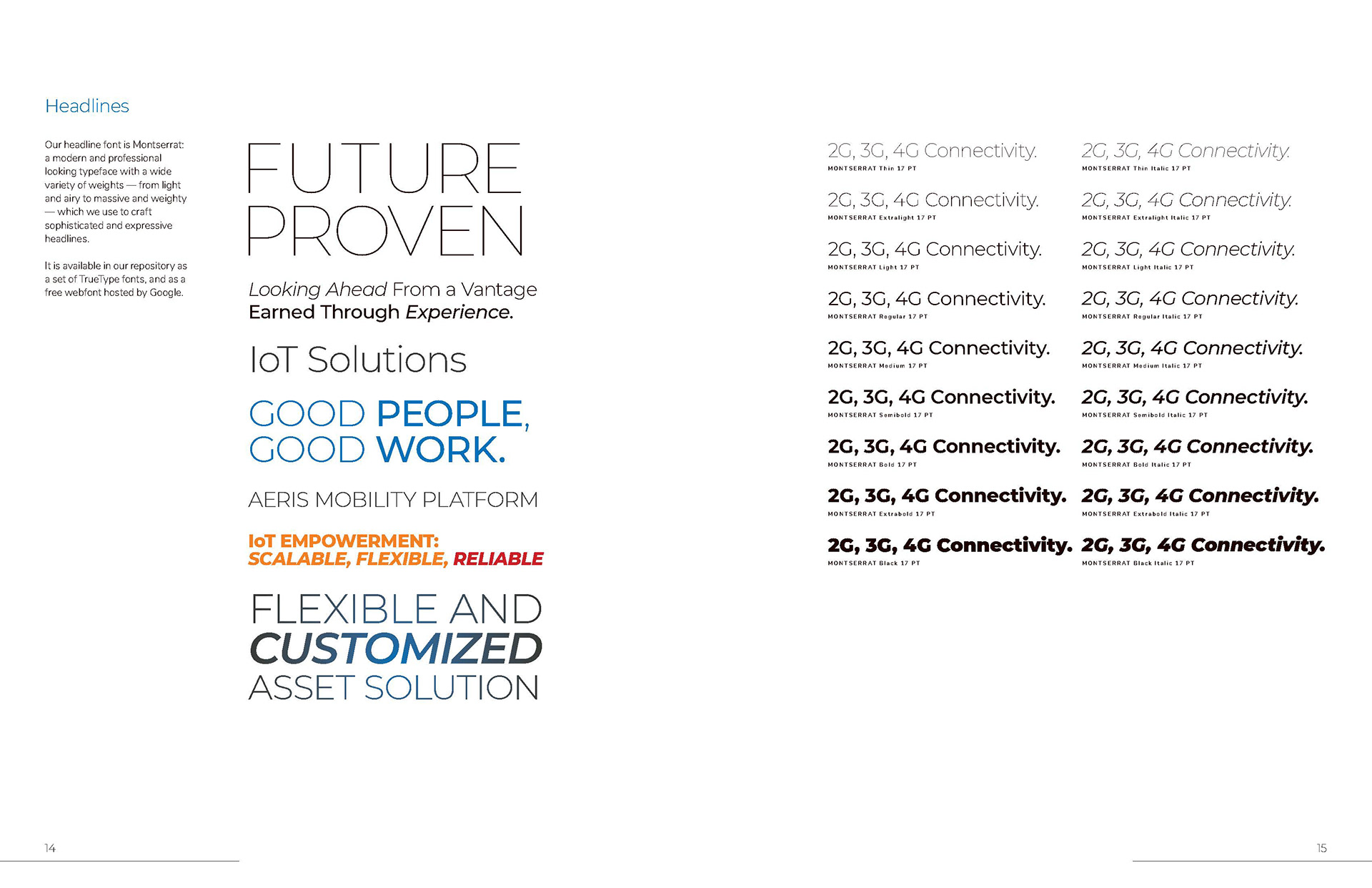
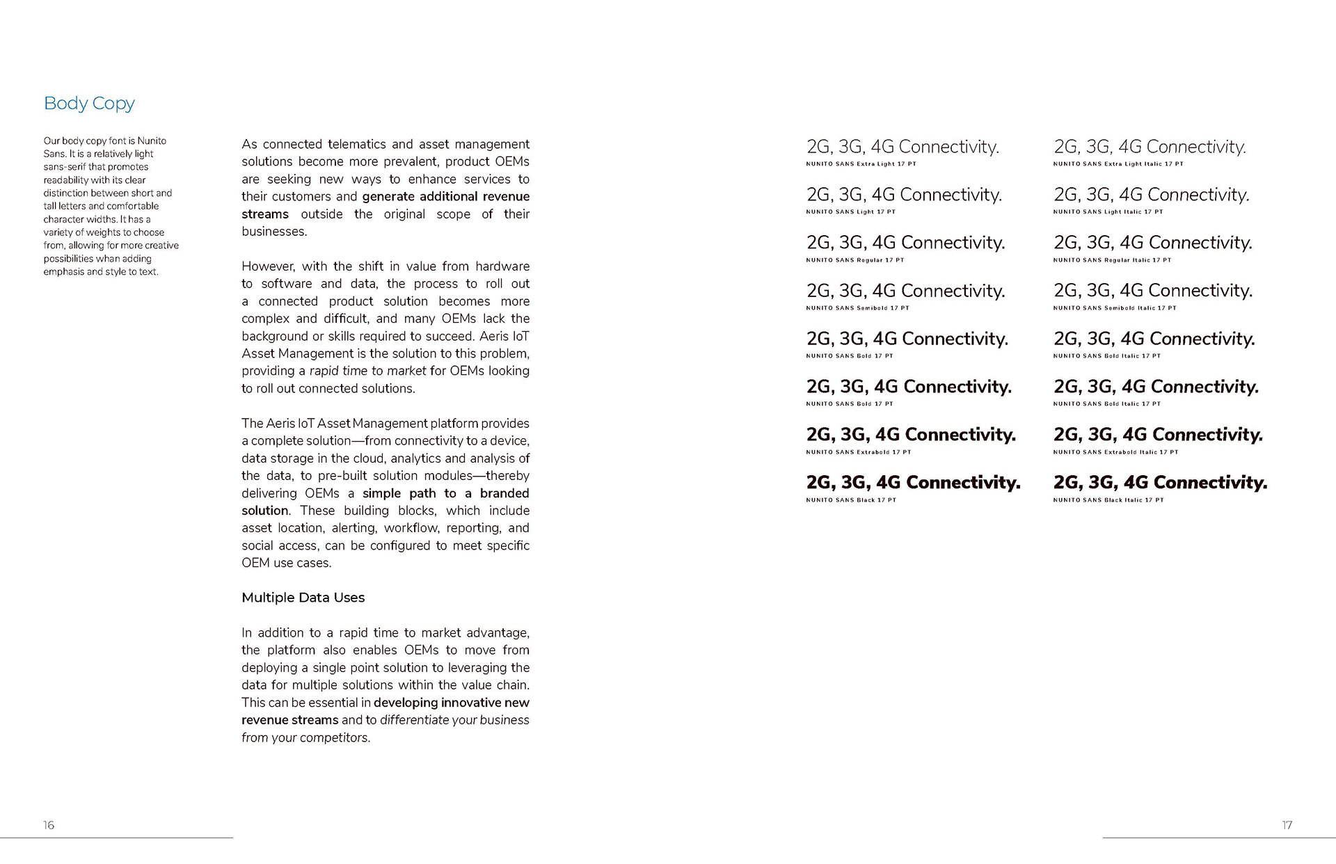
In parallel to a graphic element, it seemed prudent to move beyond the typefaces which was in use by the brand at the time, DIN Regular and DIN Bold. While beautiful, the limited set of weights made for rather monotone typographic expression.
Here we went with Montserrat for headlines and titles, Nunito Sans for long-form copy. Both available in a variety of weights, the idiosyncratic characteristics of Montserrat helped make the Aeris style a bit more recognizable amongst competitors, while the more standard glyphs in Nunito Sans are more legible in paragraphs.
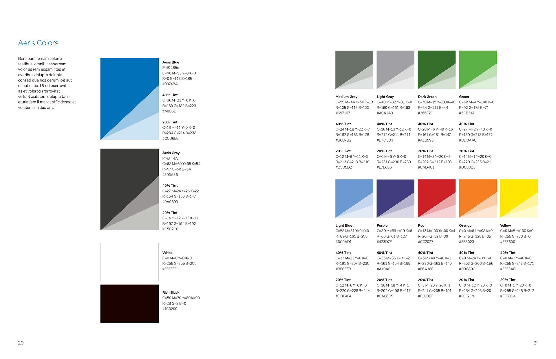
Filling the Brand with Color
If you've worked with tech brands, you've probably done a lot of work in shades of blue. Up to the time I came on, Aeris' particular shade of blue was the most consistent and recognizable element of the brand: blue fields of color and blue-tinted photos. But the brand blue wasn't doing a whole lot to help the brand stand apart from competitors.
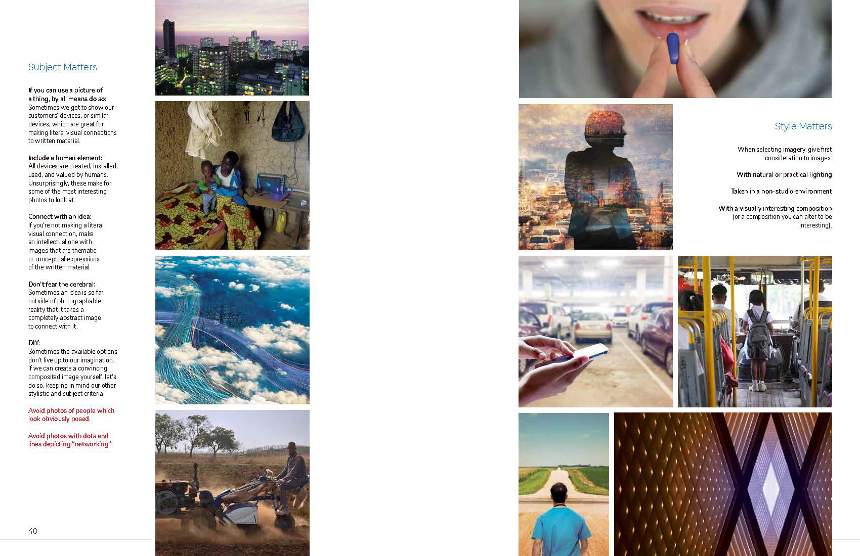
With a unique visual element people could ascribe to the brand, however, we were at greater liberty to represent the vitality of the Internet of Things with a broadened palette and full color photography.
